
Choosing a Theme for a Personalized Gift Box
Choose a personalized gift box theme by starting with what the recipient reliably likes, then use the occasion to set the tone and boundaries. Turn those signals into one clear organising concept that is specific enough to reject conflicting choices but flexible enough to allow compatible variety, then check recipient fit, occasion fit, concept clarity, visual coherence, and flexibility before choosing the contents.
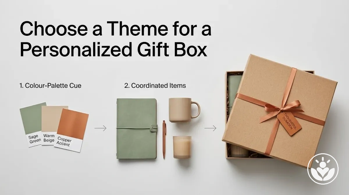
Theme decision path
Work through these five decisions in order. Each one narrows the theme without turning it into a rigid formula.
-
Recipient signal
Start with known interests, hobbies, routines, tastes, and dislikes. Prefer recurring or observable signals over assumptions.
-
Occasion boundary
Use the occasion to adjust tone, formality, and emotional emphasis without replacing recipient relevance.
-
One concept
Consolidate the strongest signals into one organising idea that is clear enough to include fitting choices and exclude conflicting ones.
-
Visual direction
Choose a restrained palette and repeat only compatible materials, motifs, textures, finishes, or shapes that reinforce the same idea.
-
Whole-box check
Keep the direction when recipient fit, occasion fit, concept clarity, visual coherence, and flexibility support the same theme. Revise the part creating conflict before selecting contents.
Decision rule: the theme should make later choices easier to include or reject; if it creates more ambiguity, refine the theme before moving on.
Treat the theme as a planning filter, not just a decorative label: it should keep recipient relevance and occasion context aligned while giving later choices one recognisable direction.
Table of Contents
Set the Theme Direction From the Recipient and Occasion
Two inputs, one direction
- Recipient
- Provides the basis for personal relevance through known preferences, interests, routines, tastes, and dislikes.
- Occasion
- Sets the tone, formality, and emotional emphasis appropriate to the situation.
- Weighting
- How strongly each input shapes the choice depends on what is known about the recipient and what the occasion represents in that relationship.
- Output
- The two inputs should converge on one theme direction; the occasion modifies its expression without replacing recipient relevance.

A theme direction that reconciles recipient relevance with occasion context creates clearer constraints for later planning decisions.
Theme choice is one decision within the broader gift box planning process, so this stage should establish the direction without moving into detailed selection decisions.
Match the Theme to the Recipient's Preferences
Base theme suitability on known recipient preferences rather than assumptions about what the recipient might like.
Interests, hobbies, routines, tastes, and dislikes provide stronger signals when they are known or observable, but no single preference needs to define the entire theme.
Use these recipient signals to evaluate whether a proposed theme has personal relevance.
A preference can support a theme when it aligns with a recurring interest or taste, while a known dislike or relevant sensitivity can rule out an otherwise plausible direction.
Preferences may be incomplete, change over time, or conflict, so look for several compatible signals before treating a theme as a strong fit.

- Interests: A sustained interest supports a theme that clearly relates to that subject; a passing or uncertain interest provides weaker evidence of suitability.
- Hobbies: A hobby the recipient actively pursues can support a related theme direction when it reflects their own participation rather than the giver's interests.
- Routines: Regular activities can indicate themes that fit the recipient's everyday preferences, especially when the routine is something they value rather than merely perform.
- Tastes: Known aesthetic or sensory tastes support themes consistent with those preferences and can rule out directions that clearly conflict with them.
- Lifestyle cues: Established habits and priorities can suggest theme suitability when they are based on what the recipient actually does or values, not demographic assumptions.
- Known preferences and dislikes: Explicit likes provide positive evidence for a theme, while explicit dislikes provide exclusion signals against themes built around them.
- Relevant sensitivities: Where a sensitivity is actually known, treat it as an exclusion condition for a conflicting theme rather than inferring sensitivities that have not been identified.
Use the Occasion to Set the Tone and Boundaries
Treat the occasion as a contextual modifier: it can shift the tone, formality, and emotional emphasis of a theme that already suits the recipient.
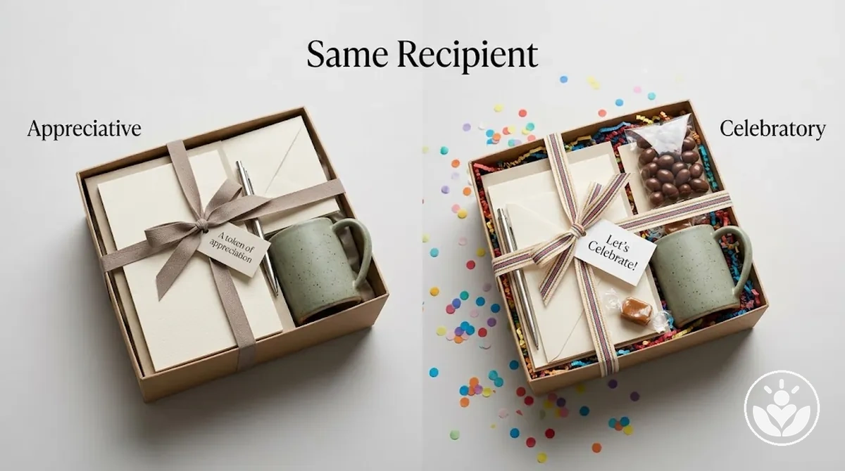
Because relationship and context can change what an occasion signifies, no single tone is universally appropriate for a given event.
Broader gift box ideas by recipient and occasion can be considered separately once these situational boundaries are clear.
Choose One Clear Theme Concept
Consolidate the strongest recipient and occasion signals into one clear theme concept that can guide later decisions.
The concept should express a coherent organising idea rather than combine several competing directions.
Whether a particular concept is suitable depends on how well it remains relevant to both the recipient and the occasion.
Use the theme concept as a filter: include choices that reinforce the central concept and exclude choices that conflict with it.
A useful filter makes those boundaries clear enough that later decisions can be assessed against the same direction.
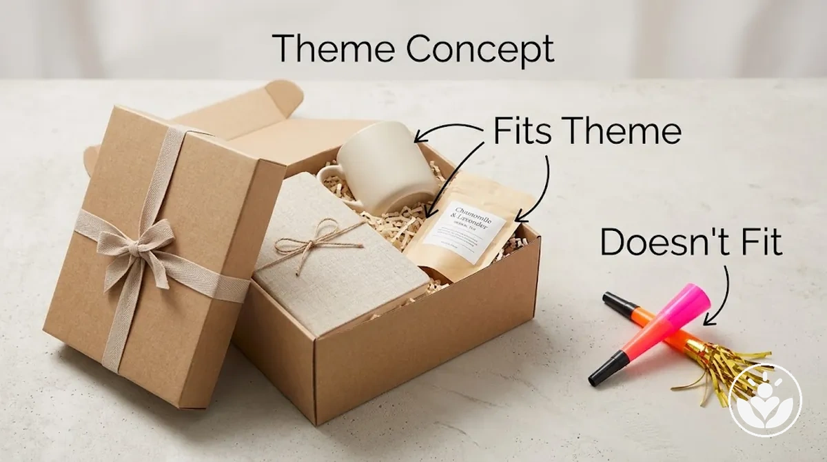
For example, if a recipient is known to enjoy quiet relaxation and the occasion calls for appreciation, those signals could consolidate into a calm appreciation theme rather than separate relaxation and celebration concepts.
Choices consistent with that direction can be included, while elements that introduce an unrelated tone can be excluded.
The aim is a clear organising concept that resolves the available signals, not novelty for its own sake.
Start From a Mood, Purpose, Interest, or Focal Idea
Mood, purpose, interest, and focal idea are alternative starting signals for forming one coherent theme.
Mood emphasises atmosphere, purpose emphasises the intended experience, interest emphasises recipient relevance, and a focal idea provides an organising anchor for related choices.
The most useful starting point depends on which signal is clearest and most relevant to the recipient and occasion.
Let the signal that provides the clearest organising direction dominate without treating the other signals as irrelevant.
More than one signal can contribute, but the dominant starting point should make the final theme easier to organise as one concept rather than several competing directions.

- Mood: Emphasises atmosphere and helps when the intended tone is the clearest signal; it can miss recipient relevance if atmosphere is considered without known preferences or context.
- Purpose: Emphasises the intended experience and helps when that purpose is clearly defined; it can remain too broad if it does not provide enough direction for related choices.
- Interest: Emphasises recipient relevance and helps when a known interest provides a clear theme direction; it can miss the appropriate atmosphere or purpose when treated in isolation.
- Focal idea: Provides an organising anchor that can connect related choices and helps when one central idea is already clear; it can become restrictive if related signals do not fit naturally around that anchor.
Whichever starting signal dominates, the resulting direction should remain one coherent theme rather than a collection of separate ideas.
Keep the Theme Specific Enough to Guide Decisions
A theme is specific enough when its boundaries consistently guide decisions by including fitting choices and excluding conflicting choices.
The scope should be clear enough to express plainly while remaining relevant to the recipient and occasion.
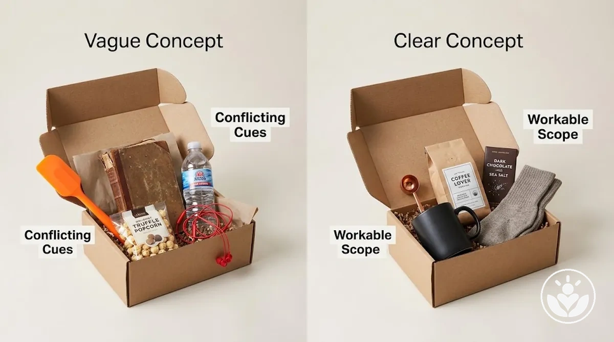
Greater clarity makes the theme boundary easier to apply to later decisions because compatible and conflicting directions are easier to distinguish.
If the scope becomes excessively narrow, however, workable options can become unnecessarily constrained.
The useful boundary therefore provides enough definition to guide choices without forcing every choice into an overly restrictive interpretation.
- Plain definition: If the theme can be stated as one clear concept, its intended direction is easier to recognise; vague wording leaves more room for conflicting interpretations.
- Recognisable boundaries: If the defined scope distinguishes what belongs from what does not, it can exclude obviously conflicting choices while leaving room for workable options.
- Recipient and occasion alignment: If the scope remains relevant to both the recipient and occasion, its boundaries support the intended context rather than narrowing the theme around an unrelated idea.
- Decision guidance: If the theme can guide decisions without dictating every detail, it provides usable direction without turning specificity into a fixed prescription.
For example, “relaxing” may be too vague if it permits several unrelated directions, while “quiet evening relaxation” creates a clearer boundary around atmosphere and context.
Narrowing it further to a rigid set of exact choices would go beyond the specificity needed to distinguish fitting from conflicting directions.
Leave Enough Flexibility for a Balanced Gift Box
Useful flexibility allows variety without making the theme unfocused or weakening its identity.
Balanced theme boundary
Compatible variety
Different functions, textures, forms, or item roles can coexist when they still support the same recognisable direction.
Competing direction
Contradictory choices fall outside the workable range; variety should not become a second theme simply for the sake of contrast.
How much variety works depends on the chosen concept and the compatible options available within it. The theme keeps its identity when variation remains inside those boundaries.
Build a Cohesive Colour Palette and Style Direction
A colour palette and style direction should express the chosen theme concept rather than become a substitute for it.
Colour and non-colour styling cues work as supporting visual attributes that reinforce the same underlying direction.
Their suitability depends on whether they remain consistent with the intended mood and the recipient-occasion context.
The colour family can establish a recurring visual cue, while materials, motifs, and other styling cues can reinforce that direction through compatible textures, forms, and finishes.
Repeating compatible visual cues supports coherence because the elements continue to express the same theme concept rather than introduce unrelated directions.
Specific colours, materials, or motifs should therefore be selected according to the theme and context rather than treated as universally suitable.
For example, a calm nature-inspired theme could use a restrained earthy colour family alongside natural-looking materials and simple botanical motifs, provided those cues fit the recipient and occasion.
The important relationship is that the visual cues coordinate around the theme concept; detailed colour and non-colour choices can then be considered separately.
Limit the Palette to Compatible Colours
Use a restrained, recurring colour palette in which compatible colours reinforce the intended theme context rather than introduce unrelated visual signals.
Compatibility should be judged against the chosen mood, recipient context, occasion, and the way the colours work together.
A dominant colour can establish the main colour direction when one colour needs greater visual emphasis.
A supporting colour can complement that direction without competing with it, while an accent can add limited contrast when it remains compatible with the palette.
These are conditional roles rather than a required formula, so a palette does not need an exact number of colours or every role.
Repetition of compatible colours can support coherence by keeping the colour signals recognisable across the theme.
- Dominant colour: When one colour carries the main visual emphasis, it should support the intended mood and context rather than conflict with the theme direction.
- Supporting colour: A supporting colour should complement the dominant colour and reinforce the same colour family or visual direction instead of introducing an unrelated signal.
- Accent: An accent can provide contrast when that contrast remains compatible with the surrounding colours and does not compete with the main palette.
- Contextual fit: Evaluate each colour in relation to the recipient context, occasion, theme intent, and surrounding colours rather than assigning it a universal meaning in isolation.
- Repetition: Recurring compatible colours can strengthen coherence, while colours that repeatedly conflict with the established palette can weaken its recognisable direction.
For example, if a muted green is used as the dominant colour, a compatible neutral could support it and a restrained contrasting accent could recur selectively where it fits the same mood and occasion.
The combination is illustrative; compatibility depends on the complete palette and theme context rather than on those colours having fixed meanings.
Repeat Compatible Materials, Motifs, and Visual Cues
Selective repetition of non-colour visual cues can reinforce theme coherence without making every item identical.
Materials, texture, motif, finish, and shape can recur where they suit the chosen theme, giving separate elements recognisable points of connection.
Repeat only the cues that meaningfully support the theme rather than applying every cue to every object.
A material might recur across several elements while a motif appears only in selected places, or related textures and finishes might echo one another without being identical.
The appropriate combination depends on the theme, so repetition should create continuity without turning variation into a competing visual direction.
- Materials: Repeating compatible materials, such as selected natural-looking materials in a nature-inspired theme, can reinforce the same thematic direction without requiring every element to use the same material.
- Texture: Related textures can echo one another across selected elements when their tactile or visual character supports the theme rather than introducing a conflicting cue.
- Motif: A recurring motif can provide a recognisable thematic signal when it appears selectively instead of being applied to every available surface.
- Finish: Compatible finishes can support continuity when their visual character belongs to the same theme, while an unrelated finish can introduce a competing signal.
- Shape: Repeated or related shapes can provide another point of visual continuity when they reinforce the concept without forcing all objects into an identical form.
Repeated visual cues should support the chosen theme rather than overpower it or become a substitute for item suitability.
Where these theme-level cues begin to affect which individual items belong together, the next boundary is to create a cohesive item selection.
Check That the Theme Can Guide the Whole Gift Box
A workable theme should function as a decision rule across recipient fit, occasion fit, concept clarity, visual coherence, and flexibility.
The final theme check asks whether those five dimensions support one usable direction before content selection or assembly begins.
A weak result in any one area is a revision signal rather than an objective failure.
If a criterion conflicts with the others, revise the concept or simplify competing cues until the theme gives clearer guidance.
The action depends on which part of the theme is creating the conflict.
- Recipient fit: If the theme remains relevant to the recipient, keep it; if the connection feels weak or assumed, revise the concept toward a more relevant direction.
- Occasion fit: If the theme suits the occasion context, retain it; if the tone or emphasis conflicts with that context, adjust the theme rather than forcing the mismatch.
- Concept clarity: If the theme can guide later choices consistently, it is usable; if its boundaries create conflicting interpretations, simplify or clarify the concept.
- Visual coherence: If colour and non-colour cues reinforce the same direction, keep them aligned; if several cues compete, simplify the visual signals that do not support the main concept.
- Flexibility: If the theme leaves room for compatible variety while excluding contradictory choices, it is workable; if it becomes too restrictive or too unfocused, revise its scope.
When these checks point in different directions, revise the theme concept until the strongest conflicts are resolved and the theme can guide the whole gift box consistently.
Confirm the Theme Supports a Coherent Range of Contents
A viable theme should accommodate varied potential contents while keeping a clear thematic relationship between them.
The theme acts as the constraint, so each content choice should support the same purpose, mood, or recipient relevance rather than simply adding variety for its own sake.
Complementary roles can create useful variety when different contents still fit the same concept, while repeated choices can make the range unnecessarily narrow and unrelated choices can weaken compatibility.
For example, a quiet relaxation theme can support contents with different roles when each still contributes to the same calm purpose and recipient relevance.
Use the theme to filter potential contents before moving into detailed selection.
Once that validation is complete, the next boundary is to choose gift box contents.
- Thematic relevance: A potential content choice fits when its purpose, mood, or recipient relevance supports the theme; if that relationship is weak, reconsider the choice.
- Complementary roles: Different contents can work together when they contribute distinct but compatible roles under the same concept rather than repeating the same function without reason.
- Reasonable variety: The theme should allow enough variation to avoid unnecessary repetition while keeping the contents recognisably connected.
- Absence of contradiction: A potential content conflicts with the theme when its attributes introduce a purpose, mood, or recipient signal that contradicts the established direction.
Common Gift Box Theme Planning Mistakes
Correction pattern
- Identify the planning error. Locate the decision that weakens recipient fit, occasion fit, or coherence.
- Trace the likely consequence. Ask whether the theme becomes less relevant, less contextually suitable, or harder to recognise as one direction.
- Use a recognition cue. Treat the cue as a signal that the theme logic may be creating conflict, not as proof of objective failure.
- Correct the relevant part. Revise the theme logic or simplify competing signals until the direction becomes clearer and more suitable.
Choosing for Your Own Preferences Instead of the Recipient's
Projection occurs when giver preferences drive the theme choice even though known recipient preferences point in a different direction.
Giver taste can overlap with recipient preferences without creating a problem when that overlap is independently supported by known signals about the recipient.
The mistake is using the giver's preference as a substitute for recipient signals, which can weaken recipient relevance.
A recognition cue is that the main reason for the theme reflects what the giver likes while available recipient signals conflict with or do not support it.
When recipient knowledge is limited, the correction is to use broader signals that are actually known rather than inventing specific preferences; uncertainty does not justify treating giver preferences as recipient preferences.
Re-test the theme choice against known signals about the recipient and revise it when those signals point elsewhere.
Mixing Too Many Colours or Competing Theme Cues
Competing theme cues become a planning mistake when unrelated colours, materials, motifs, or tones make the intended theme harder to recognise.
Individual choices can still be attractive on their own, but when several signals compete for visual dominance, visual coherence can weaken and no single dominant theme remains clear.
A recognition cue is that different elements suggest separate theme directions instead of reinforcing the same one.
The correction is to remove or consolidate cues so a smaller set of compatible signals repeats the intended direction without requiring every element to look identical.
For example, a theme combining unrelated colour directions, contrasting material signals, and disconnected motifs can become clearer when the conflicting cues are removed and the remaining colours, materials, motifs, and tones support one direction.
Consolidate around the dominant theme rather than adding further styling to compensate for competing cues.
Choosing a Theme That Is Too Broad or Too Restrictive
A theme can fail in two opposite ways: a broad scope may provide boundaries that are too weak to filter choices, while a restrictive scope may constrain the theme so tightly that it cannot support enough compatible variety.
Broad themes can allow conflicting choices to compete under the same concept.
Restrictive themes can lead to forced choices or unnecessary repetition when few available options fit the defined boundary.
Judge theme scope by its usefulness for decisions rather than by a fixed number of allowed choices.
If many unrelated choices appear equally compatible, clarify or narrow the boundaries; if compatible options repeatedly have to be excluded or similar choices forced to fit, broaden the scope.
The workable range depends on the recipient, occasion, and available compatible options.
Use the contrast below to distinguish which boundary error needs correction.
- Too broad: The recognition cue is that the theme fails to filter choices and allows competing or conflicting directions to appear equally relevant. The likely consequence is ambiguity about which choices reinforce the theme. Correct it by narrowing or clarifying the boundaries until unrelated choices can be excluded.
- Too restrictive: The recognition cue is that the theme excludes otherwise compatible variety or repeatedly pushes choices toward the same narrow form. The likely consequence is forced choices, repetition, or too little workable variety. Correct it by relaxing unnecessary boundaries while retaining enough definition for the theme to guide decisions.
The target is a clear theme with enough boundaries to filter choices and enough room for compatible variety to remain workable.