
How to Make a Personalized Gift Box Look Polished
A polished personalized gift box looks intentional when the finishing layers reinforce one visual hierarchy: carry the established palette through the tissue paper, ribbon and tag; keep tissue proportionate to the box and contents; refine folds, edges and joins; and use decorative accents with restraint. Coherence, neat execution, secure fastening and proportion matter more than adding extra embellishment.

Polished gift-box finish: five checks
Use these relationships as a final presentation check. The aim is not one universal aesthetic; it is a box whose finishing choices look deliberate, balanced and secure together.
Decision rule: when one finishing detail breaks the hierarchy, correct that element first. If the finish passes these checks but the box still looks unbalanced, inspect the underlying item arrangement rather than adding more decoration.
This guide focuses on the final presentation of an already planned and assembled personalized gift box. The exact finish can vary with the box, contents, materials, occasion and intended style, so use the checks as relationships to control rather than as a single aesthetic formula.
The first improvement to consider is colour coherence: the existing palette should remain visually connected as the finishing layers are added.
Table of Contents
Carry the Existing Colour Palette Through the Final Presentation
The final finishing layer should extend the colour palette already established in the gift box presentation rather than introduce a competing colour system.
Repeating those colours through visible finishing materials such as tissue paper, ribbon, and a tag helps the final layer read as part of the same design.
The useful variables are the role each colour plays, the strength of any pattern, and the resulting visual balance.
The palette should already reflect the decisions made when you choose a consistent theme; at this stage, the task is to carry those decisions through the finishing materials.
The image shows how the established colour palette continues across tissue paper, ribbon, and a tag while keeping the accent visually subordinate to the dominant and supporting colours.

- Dominant colour: repeat the main colour across the most visible finishing areas so the presentation stays connected to the established colour palette.
- Supporting colour: use a secondary colour to reinforce the dominant colour without competing with it for primary attention.
- Accent colour: use an accent tone selectively on a ribbon, tag, or another small finishing detail so it draws attention without becoming a second dominant colour.
- Pattern intensity: pair a strong pattern with simpler surrounding finishes so the pattern remains intentional rather than competing with other focal signals.
- Visual balance: check whether the dominant, supporting, and accent colours create a clear hierarchy across the visible finishing materials instead of giving every element equal emphasis.
Coordinated repetition can make the final presentation appear more cohesive, while several equally strong accents can fragment its visual continuity.
Strong contrast can still remain controlled when the surrounding tissue paper, ribbon, tag, and pattern treatment are sufficiently simple.
This stage does not require choosing a new theme or reconsidering which gifts belong together; decisions about how to curate items for visual coherence belong to the item-curation context.
Here, the task is limited to keeping the final presentation layer consistent with the colour palette already in place.
Coordinate Tissue Paper, Ribbon, and Tags With the Chosen Palette
Tissue paper, ribbon, and the gift tag should act as supporting accents within the chosen palette rather than as separate focal systems.
Their colour, finish, and pattern can repeat, complement, or deliberately contrast with the palette while keeping the main gift box presentation visually dominant.
The image shows how tissue paper, ribbon, and a gift tag can share or complement the chosen palette while retaining distinct material finishes and a clear focal hierarchy.

- Tissue paper: repeat or complement a colour from the chosen palette, using a solid or patterned treatment that supports the box rather than becoming the strongest visual feature.
- Ribbon: use colour and texture as an accent, with a matte or glossy finish providing more or less emphasis depending on the surrounding surfaces and palette.
- Gift tag: use complementary or controlled contrasting colour so the tag remains visually distinct, while its pattern and finish stay subordinate enough to avoid competing with the ribbon and tissue paper.
Finish and pattern can change emphasis according to the surrounding palette and focal hierarchy, so an attention-catching surface is easier to keep controlled when nearby treatments are quieter.
For example, patterned tissue paper with a restrained solid ribbon and simple gift tag can provide coordinated support, while strong patterns and high-emphasis finishes across all three materials can create competing visual noise.
Limit Competing Colours and Patterns
Contrast can create intentional emphasis, but competing colours and patterns become a problem when several strong visual signals pull attention at the same time.
The aim is not to eliminate contrast or pattern; it is to maintain a visual hierarchy in which one focal colour or accent remains easier to identify than the surrounding decoration.
The comparison image shows the same general gift-box context with controlled emphasis and with several competing visual signals, illustrating visual hierarchy rather than judging either presentation as objectively more attractive.
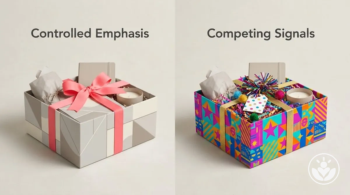
Observable signs of visual competition appear when colour, pattern, or motif intensity creates several possible focal points instead of supporting one clear emphasis.
- Multiple focal colours: several high-contrast colours draw similar levels of attention, making the intended focal colour less distinct.
- Overlapping strong patterns: prominent patterns on multiple visible surfaces can compete with one another and weaken the visual hierarchy.
- Repeated novelty motifs: conspicuous motifs repeated across several finishing details can become additional focal signals rather than supporting accents.
- Attention-pulling accents: an accent that competes with the gift or other primary focal area can contribute to visual clutter instead of reinforcing emphasis.
Stronger contrast can still remain intentional when the surrounding colours, patterns, and decorative signals are sufficiently simple to leave one clear point of emphasis.
Restraint therefore supports the visual hierarchy rather than imposing minimalism as a universal rule.
Use Tissue Paper for a Neat Interior Finish
Tissue paper creates a neat interior finish by lining the box, framing visible item edges, providing controlled coverage, or softly enclosing the contents.
The image shows tissue paper used as an interior presentation layer with controlled folds and proportionate coverage rather than as structural cushioning.

What changes the tissue-paper finish
- Coverage and sheet size
- The box interior and item size determine the area to line or frame; sheet size affects whether the coverage sits neatly or creates excess bulk.
- Opacity
- More opaque tissue conceals more of the contents, while more translucent tissue can leave shapes and edges visible through the layer.
- Texture
- Texture changes the visual effect and how noticeable wrinkles or folds remain, so match it to the intended degree of enclosure and surface finish.
For example, tissue paper fitted to the available interior space can frame the contents while keeping item edges visible and the surrounding material controlled.
An oversized sheet that is heavily crumpled into the same space can add bulk, create wrinkles and crowded edges, and obscure more of the presentation.
Tissue paper is primarily an interior presentation layer, not reliable structural cushioning. Use it for lining, framing and visual coverage; when the contents need structural support or impact protection, use fillers for support and presentation according to the needs of the contents and box.
Keep Tissue Proportionate to the Box and Contents
Tissue paper is proportionate when its visible volume suits the box depth, item height, tissue thickness, and desired enclosure while leaving enough interior space for the contents to remain clearly presented.
A fixed sheet count is not a reliable measure because the same amount of tissue can occupy different volumes under different box and content conditions.
The comparison graphic shows how tissue proportion changes with box depth and item height while maintaining clear item exposure and proportionate framing.

- Sheet coverage: too little tissue can leave broad areas of the box looking sparse, while too much coverage can overlap heavily and conceal parts of the contents.
- Fold depth: shallow folds can provide too little visible framing, while deeper or compressed folds can create unnecessary bulk around the items.
- Visible volume: proportionate tissue volume frames the contents without dominating them; excessive volume can produce puffiness, wrinkles, or bulky corners.
- Item exposure: insufficient tissue can leave items visually under-framed, while excessive tissue can conceal details that should remain visible.
- Interior space: proportionate tissue leaves usable space around the contents, whereas excessive tissue can crowd the remaining interior space and press around taller items.
The three useful states are insufficient tissue, where the presentation appears sparse or under-framed; proportionate tissue, where the tissue frames the contents while preserving the intended item exposure; and excessive tissue, where puffiness, wrinkles, bulky corners, or accidental concealment become noticeable.
The suitable state depends on the box and contents rather than on one fixed amount.
A shallow box with taller items usually needs less visible tissue volume because the contents already occupy more of the interior space.
A deeper box with lower-profile contents can accommodate more tissue volume around the items without the same bulky effect, with the final proportion also influenced by tissue thickness and the desired degree of enclosure.
Refine Folds, Seams, and Visible Edges
Folds, seams, and visible edges act as finishing cues because their alignment and consistency affect how neat the completed presentation appears.
A sharp crease creates cleaner geometry, while uneven seams, wandering edges, or concentrated corner bulk can make the finish appear rushed or uneven; the exact appearance can also vary with material thickness, intended texture, and wrapping style.
The main visible cues to inspect are crease sharpness, seam alignment, edge straightness, corner bulk, and consistency across comparable folds and joins.
- Crease sharpness: a defined crease gives a fold a clearer line and cleaner geometry, while a soft or irregular crease can make the fold look less controlled.
- Seam alignment: an aligned seam keeps the join visually consistent, while a skewed seam or uneven overlap can draw attention to the join.
- Edge straightness: a visible edge that follows a clean, consistent line supports a neater finish, while waviness or changing angles can make the edge appear uneven.
- Corner bulk: a corner with controlled material volume keeps its shape more defined, while a thick overlap can create a bulky projection or uneven contour.
- Consistency: similar folds, seams, and visible edges that use comparable alignment and treatment create visual continuity, while noticeably different treatments can make the overall execution appear less cohesive.
A neat folded edge keeps the crease defined and the overlap visually controlled, whereas a bulky exposed overlap concentrates material at the join and makes that area more prominent.
This inspection identifies where refinement is needed without extending into the separate corrective work for wrinkles, excess paper, tape, or join placement.
Smooth Wrinkles and Excess Paper
Visible wrinkles, loose pockets, and corner buildup can often be reduced by adjusting excess paper and fold tension rather than repeatedly handling the whole surface.
Excess material can gather into overlaps or pockets, while paper thickness affects how much bulk develops at a corner and how readily that buildup appears as creasing.
Correct only the affected area
- Release the excess. Redistribute material where it forms a loose pocket, overlap or corner buildup.
- Smooth or refold locally. Apply enough tension to reduce the unwanted crease without repeatedly handling or overworking the whole surface.
- Respect intentional texture. Delicate, textured or deliberately crinkled materials can retain surface variation; accidental wrinkling is more likely to appear as isolated creasing around excess material or uneven tension.
Keep Tape and Joins Out of the Main View
Tape and joins should secure the finish while sitting outside the main view where the box shape, wrapping material, and join location make that practical.
The goal is to balance low-visibility placement with reliable fastening rather than conceal a seam at the expense of stability.
- Select a low-visibility edge: position the join on an underside, rear edge, or another area outside the primary viewing angles where practical, while keeping the fastening accessible and secure.
- Align the join: bring the seam into consistent alignment and keep the overlap controlled so the joined edges sit neatly without unnecessary exposed material.
- Apply the necessary fastening: use enough tape or other appropriate fastening to hold the overlap securely, avoiding extra visible fastening that does not contribute to stability.
- Inspect from the main viewing angles: check the finished box from the angles in which it will normally be seen, confirming that the join remains secure and visually subordinate rather than drawing attention away from the presentation.
Stability takes priority over hiding the tape or join. If a low-visibility position cannot hold the overlap securely, use the position that keeps the fastening reliable.
A seam running through a central visible surface is more prominent in the main view, whereas a similarly secure join positioned on the underside or rear edge can remain less visually dominant when the box configuration allows it.
Add Decorative Finishing Details With Restraint
Decorative finishing details should reinforce an existing focal point rather than compensate for a presentation that already feels crowded.
An accent works best when its scale, placement, colour, and texture support the established visual hierarchy and balance; if it competes with the main presentation for attention, it is adding decoration rather than useful emphasis.
The main decision criteria are purpose, scale, placement, contrast, repetition, and whether the detail strengthens the intended emphasis without creating unnecessary competition.
- Purpose: use a finishing detail when it has a clear role, such as reinforcing the focal point or providing a deliberate secondary accent, rather than filling space without a visual reason.
- Scale: keep the accent proportionate to the surrounding presentation; a visually dominant detail can shift emphasis away from the intended focal point.
- Placement: position the detail where it supports the existing hierarchy, rather than where it divides attention between several competing areas.
- Contrast: colour or texture contrast can make an accent more prominent, so stronger contrast should correspond to the amount of emphasis that detail is intended to carry.
- Repetition: repeating an accent can create continuity when the repetitions remain subordinate, but too many similar focal details can crowd the composition.
- Contribution to emphasis: keep the detail when it clarifies the focal point or improves balance; reconsider it when it merely adds another competing element.
For example, a ribbon, bow, or tag used as one controlled accent can reinforce the focal point, while several similarly prominent accents can compete with one another and make the same presentation feel overloaded.
Whether the result appears restrained depends on the scale, contrast, placement, and repetition of those details within the rest of the composition.
Use Ribbon or a Bow as a Controlled Accent
Ribbon or a bow works best as a controlled focal accent when its scale, tension, and placement remain proportionate to the box.
Its width, colour, texture, and position should support the existing presentation rather than dominate it.
- Width: choose a ribbon width that suits the visual scale of the box; a very wide ribbon can dominate a small box, while a very narrow ribbon may contribute too little emphasis on a larger surface.
- Tension: keep the ribbon secure enough to sit neatly against the box without appearing loose or distorted, because slack tension can make an otherwise tidy accent look unfinished.
- Bow size: keep the bow proportionate to the box and surrounding presentation so it functions as a focal accent rather than covering or overpowering the main surface.
- Tail length: use tail length that supports the bow without creating excessive visual weight or extending so far that the ribbon becomes the dominant feature.
- Placement: position the ribbon or bow where it reinforces the intended focal point; centred placement can work in some compositions, while an offset position may suit others depending on the box shape and wrapping style.
- Palette relationship: use ribbon colour and texture that relate clearly to the existing palette, whether by repetition, complement, or controlled contrast, so the accent remains connected to the overall presentation.
For example, a small box can be visually overwhelmed by an oversized bow with long tails, while a more proportionate bow can emphasise the same box without taking over the composition.
No single ribbon material, knot style, or placement is inherently more polished because the visual result depends on the box size, palette, and intended wrapping style.
Add a Gift Tag or Personal Note Without Crowding the Design
A gift tag or personal note should remain legible and personal without displacing the existing focal hierarchy or using up the whitespace that keeps the presentation visually balanced.
Its size, text density, material, contrast, and placement should support readability while keeping the tag or note subordinate to the main accent.
- Size: choose a gift tag size that fits the available whitespace without covering important parts of the presentation; as tag size or text density increases, more visual space is required to preserve legibility.
- Placement: position the tag where it supports the focal hierarchy and leaves breathing room around nearby elements rather than filling an open area simply because space is available.
- Contrast: keep enough contrast between the text and its background for the personal note to remain legible; strong patterns or competing surface details can reduce visual separation around the text.
- Attachment point: attach the gift tag at a point that keeps it secure and readable without forcing it across the main focal area or causing it to compete with another finishing detail.
- Inside or outside: an outside tag can suit a note intended to be visible with the presentation, while an inside position can preserve exterior whitespace or provide more privacy; the appropriate placement depends on the box structure, note size, and design intent.
For example, a proportionate tag with restrained pattern intensity can support the main accent, while a larger tag with a visually strong pattern can compete with that same focal point.
Keeping the text readable and preserving sufficient whitespace around the tag or personal note helps maintain legibility and visual balance.
Check for Presentation Details That Make the Box Look Unpolished
A final check should verify observable finishing conditions that can make the gift-box presentation appear unfinished or visually inconsistent.
It is a verification pass for local corrections, not a new design phase or a reason to reopen choices that already work together.
The checklist consolidates visible conditions from the earlier finishing steps so each one can be checked for coherence, neatness, security, and contextual fit before the presentation is considered complete.
- Palette coherence: verify that the visible colours still relate clearly to the established palette; adjust only an element that creates an unintended colour conflict.
- Tissue bulk: check that tissue frames the contents without excessive puffiness, bulky corners, or unintended concealment; redistribute excess tissue where needed.
- Wrinkles: check for accidental wrinkles or loose pockets that interrupt an otherwise controlled surface; smooth or refold only the affected area where the material allows.
- Crease quality: verify that comparable folds and visible edges appear consistently defined for the chosen material and wrapping style; refine an uneven fold if it disrupts that consistency.
- Seam visibility: check whether a seam unnecessarily draws attention in the main view; reposition or refine the join where practical without weakening the fastening.
- Tape exposure: verify that visible tape is limited to what is needed for secure fastening and does not become an unintended focal detail; conceal or reduce unnecessary exposure where practical.
- Accent proportion: check that a ribbon, bow, or other chosen accent supports the focal hierarchy rather than dominating the box; reduce or reposition it if it creates unintended competition.
- Tag placement: verify that the gift tag or personal note remains legible, secure, and balanced within the available whitespace; adjust its position if it crowds the focal area.
- Visual crowding: view the presentation as a whole and check whether finishing details compete for attention; remove or reduce only the element creating unnecessary visual competition.
A failed check should trigger the smallest local correction that resolves the visible problem rather than a complete redesign.
Style-dependent features such as symmetry, minimalism, or accent intensity do not need to follow one universal standard; the useful test is whether the chosen presentation appears intentional, coherent, secure, and suited to its context.
If the finishing details pass these checks but the box still appears unbalanced because the contents themselves are crowded, unstable, or visually disconnected, the underlying issue may be item placement rather than surface finishing; in that case, improve item arrangement instead of adding more decoration.
Keep that adjustment limited to cases where arrangement is clearly the source of the unpolished appearance rather than reopening broader gift-box planning.