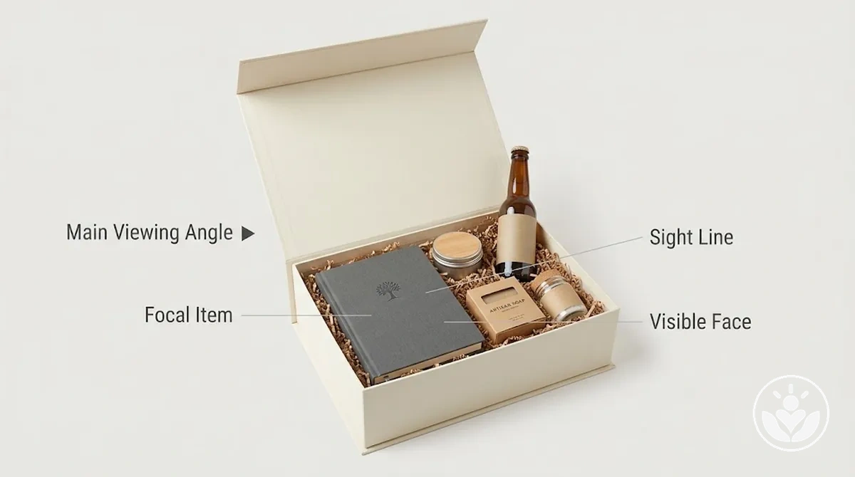
Arrange items in a personalized gift box by choosing the focal item first, placing large or tall items as spatial anchors, layering supporting items by size, height and depth, then adjusting spacing and overlap before checking the composition from the main viewing angle. Use visibility and visual hierarchy—not fixed centre or rear positions—as the decision rule; the best position changes with each item’s size, shape, orientation and role.
A practical arrangement sequence
Work from the box’s most likely first viewing angle. Each step protects the focal hierarchy while keeping supporting items identifiable.
Choose the focal itemGive priority to the item meant to attract attention first, then test whether its size, shape, orientation and visible face leave usable placement zones around it.
Set the spatial anchorsPlace large or tall items early. Rear, side and off-centre positions are all valid when they preserve the focal sight line and do not consume unnecessary foreground space.
Layer supporting itemsAssign foreground, middle, background or side zones by footprint, height, depth and orientation. Keep smaller items visible rather than hiding them to make them subordinate.
Balance the compositionAdjust spacing, overlap, negative space and left-right visual weight. Equal gaps are not required; the goal is coherent attention around the focal item.
Verify and correctCheck focal recognition, smaller-item visibility, readable faces and blocked sight lines. Make the smallest useful positional change, then recheck from the same viewing angle.
If crowding or obstruction remains after repositioning: the usable box space is the limiting factor, so choose a box that fits before continuing.
If the box has more than one plausible first view: repeat the visibility check from the second likely viewing position.
Personalized gift box arrangement is the deliberate positioning of selected items so visual hierarchy, usable placement zones, balance and visibility work together; box sizing, filler, securing and decorative finishing are separate tasks unless they directly limit placement.
Table of Contents⌄
Set the Focal Item Before Placing Supporting Items
Choose the focal item before positioning supporting items, then orient its intended face so it can attract attention first from the main viewing angle while leaving usable placement zones around it.
Visual priority identifies which item should be noticed first; spatial suitability determines whether that item can hold the focal role given its size, shape, orientation and viewing angle.
Placement assumes the contents have already been selected; if that decision is still unresolved, curate compatible items before arranging them.
Focal-item placement criteria
Visual importance
give placement priority to the item intended to attract attention first.
Relative size
evaluate whether its footprint leaves usable placement zones for supporting items rather than allowing size alone to determine prominence.
Shape and orientation
orient the focal item so its form works with the available space and intended visual direction.
Readable or visible face
position any meaningful label, message, image, or distinctive face where it remains visible from the intended view.
Main viewing angle
check the focal item's position from the direction in which the open box will first be seen.
Arrange Items by Size, Height, and Depth
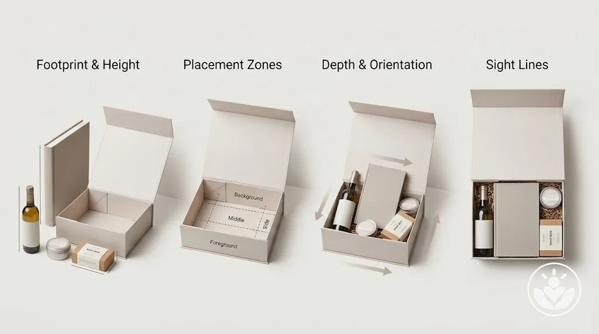
Assess each item's footprint and height before assigning its depth and position in the gift box.
Use those dimensions with orientation and focal priority to decide whether an item belongs in a foreground, middle, background, or side placement zone; a tall item is not automatically a background item because its footprint and viewing angle can change the appropriate position.
Placement sequence
Assess footprint and height: compare how much base space each item occupies and how high it rises; check which items could obstruct another item's visible face from the main viewing angle.
Assign broad placement zones: place items provisionally in foreground, middle, background, or side zones according to their visual role and available space; check that the focal priority remains clear.
Stagger depth and orientation: vary how far forward or rearward items sit and orient their visible faces toward the viewing angle; check that layering creates separation rather than unnecessary overlap.
Verify sight lines: view the arrangement from the intended opening angle and check whether important faces remain visible; reposition items when their height, depth, or visual mass creates avoidable obstruction.
For example, a taller item can occupy a rear or side zone while shorter items sit at different depths toward the foreground, provided their orientations preserve the intended visual hierarchy. Staggered depth can keep more visible faces within the sight line than placing every item on one plane.
Place Large and Tall Items First
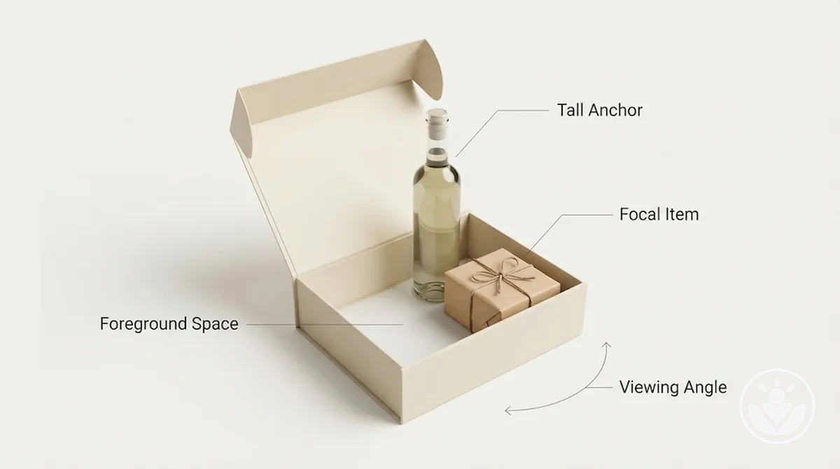
Place large items and tall items early because their footprint and height establish a spatial anchor for the remaining arrangement.
Their exact position should follow the main viewing angle and focal item relationship, so test footprint, placement, and visibility before positioning other items around them.
Check footprint and height: assess how much available space the item occupies and whether its height can cross the sight line to the focal item.
Choose the anchor position: test a rear, side, or slightly off-centre position according to the viewing angle and focal relationship; check that the large or tall item does not consume unnecessary foreground space.
Verify the sight line: view the box from its main opening angle and confirm that the focal item remains visible while usable foreground space remains available.
Rear placement can protect sight lines when a tall item functions as a background anchor, but rear position is not a fixed rule.
Side or off-centre placement can be more suitable when placing the item behind the focal item would obstruct its visibility or consume too much foreground space from the main viewing angle.
Position Shorter and Smaller Items Where They Remain Visible
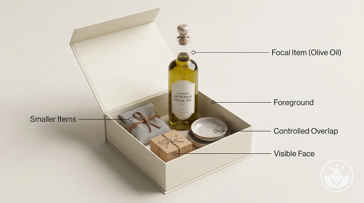
Position shorter items and smaller items in the foreground or another supporting position where their important visible face remains identifiable without competing with the focal hierarchy.
Check visibility, overlap, orientation, and label or message exposure so a smaller item does not disappear behind surrounding gifts.
Keep smaller items identifiable
Visible face
check that the identifying face or feature remains within the main sight line rather than being obscured by a taller item.
Overlap
use partial overlap only when it creates depth without hiding the feature that makes the smaller item identifiable.
Orientation
orient the smaller item so its important face remains visible from the main viewing angle while it stays subordinate to the focal item.
Label or message exposure
expose a label or message when it is necessary for recognition rather than allowing surrounding items to cover it.
Controlled overlap can create a clear depth relationship between supporting gifts, but lower prominence does not require a smaller item to be hidden.
Group smaller items intentionally so their orientation and overlap support the hierarchy while preserving the visibility needed to identify each relevant item.
Adjust Spacing, Overlap, and Visual Weight for Balance
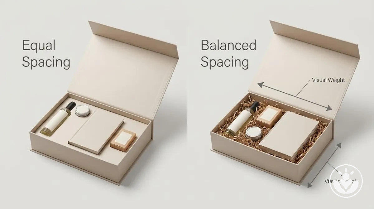
Equal spacing
Uses similar gaps between items, but it does not guarantee balance because different items carry different amounts of visual weight.
Visual balance
Distributes attention intentionally through spacing, overlap and position while keeping the focal item dominant and supporting items coherent.
Adjust the arrangement after the main placements are set so the focal item remains dominant while supporting items feel coherently distributed.
Visual weight is influenced by an item’s apparent size, height, shape, colour intensity and position, while negative space affects how separated or grouped those items appear.
Balance may be symmetrical when visual weight is distributed similarly across the composition, or asymmetrical when unequal elements still distribute attention coherently around the focal item.
Balance controls
Spacing
compare the gaps between related items and adjust them so the grouping appears intentional rather than mechanically uniform or disconnected.
Overlap
use overlap where it adds depth or connection, but keep important faces, labels, and identifying features visible.
Left-right visual weight
compare the apparent visual weight on each side and reposition items when one side draws disproportionate attention without supporting the intended hierarchy.
Height distribution
evaluate whether item heights create a coherent visual progression or concentrate too much visual weight in one area.
Negative space
retain open areas when they help separate groups or clarify the focal item, and reduce gaps that make related items appear unintentionally isolated.
Focal and supporting relationship
verify that supporting items contribute to the composition without competing with the focal item's visual dominance.
Controlled variation in spacing and overlap can create depth when visibility and hierarchy remain clear. Whether the composition is symmetrical or asymmetrical, the result should distribute attention coherently while preserving the focal hierarchy.
If unwanted gaps cannot be corrected through repositioning without reducing visibility or balance, fill unwanted empty space as a separate step.
Check Item Visibility From the Main Viewing Angle
The main viewing angle is the position from which the recipient is most likely to first see the open gift box, and item visibility should be checked from that position.
Use the view to verify the visual hierarchy and identify obstruction before making further adjustments.
Visibility check
Focal-item recognition: verify that the focal item is immediately recognizable and that its important visible face is not obscured from the main viewing angle.
Smaller-item visibility: check that smaller items remain identifiable rather than disappearing behind taller or overlapping items.
Label or message readability: check that a relevant label, message, or readable face remains exposed when it is necessary for recognizing the item or its intended meaning.
Blocked sight lines: identify any orientation or overlap that places another item across an important sight line and creates avoidable obstruction.
Tall-item obstruction: verify that an important item does not disappear behind a taller item from the primary viewing position.
If the box design creates more than one plausible first viewing angle, repeat the visibility check from the second likely viewing position rather than assuming one angle represents every view.
Once the important items pass the relevant visibility checks, polish the presentation as the next, separate stage.
Correct Common Gift Box Arrangement Mistakes
The main gift box arrangement mistakes are placement choices that weaken visual hierarchy, visibility or balance.
Diagnose each mistake by its visible consequence and recognition cue, then use the smallest positional change that restores a clear composition without disturbing placements that already work.
Diagnose by cue, then correct the cause
No clear focal item
Consequence
A weak visual hierarchy in which several items compete for attention.
Recognition cue
No single item is readily identifiable as the intended focal item from the main viewing position.
Correction
Repositioning or reorienting the intended focal item so its visual role becomes clearer while supporting items remain subordinate.
Hidden items
Consequence
Smaller gifts positioned behind larger items can lose visibility through obstruction.
Recognition cue
An important face, label, or identifying feature disappearing from the relevant sight line.
Correction
Shifting the hidden item forward or sideways, or adjusting its orientation, until the necessary feature becomes visible.
Crowding in one area
Consequence
Concentrating too many items in one part of the box can create uneven visual weight and leave the rest of the arrangement disconnected.
Recognition cue
A dense cluster on one side combined with comparatively unused space elsewhere.
Correction
Redistributing one or more supporting items while keeping the focal relationship intact.
Flat height plane
Consequence
Placing visually important items at nearly the same apparent height can flatten the composition and weaken depth cues.
Recognition cue
Item tops or visible faces form a similar height plane with little distinction between foreground and background relationships.
Correction
Changing the position or orientation of selected items so their apparent heights and depth relationships become more distinct.
Excessive overlap
Consequence
Too much overlap can create hidden items and blocked sight lines.
Recognition cue
An important visible face or identifying feature is covered by another item.
Correction
Reducing the overlap or changing orientation only enough to restore the required visibility.
Accidental spacing
Consequence
Irregular gaps can make related items appear unintentionally isolated or make one area seem unnecessarily compressed.
Recognition cue
Spacing that does not support the grouping, visual weight, or hierarchy established elsewhere in the arrangement.
Correction
Adjusting the nearest items until the spacing appears intentional while preserving useful negative space.
These are placement corrections only: if an otherwise correct arrangement repeatedly fails because items shift after placement, keep items from moving as a separate task rather than continuing to reposition them.
Stop once the diagnosed arrangement mistake and its visible consequence have been corrected.